Drawing Outside The Lines: Shawn Brauch of Pen and Pixel
Written by Greg Harris
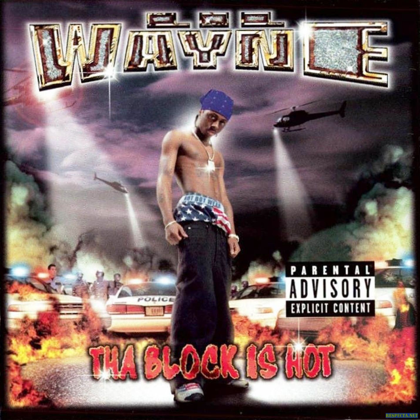
Art has played a pivotal role in the way we can perceive the world, so it’s only right the spotlight goes to those who create these masterpieces. In this series, we’ve highlighted the likes of Trxntt, FatherNico, and more rising designers, but today we find ourselves approaching the conversation with a legend. A person who conceded the idea of altering the perception of a genre during its prime era and maximizing on the opportunity to create some of the boldest covers ever known to man.
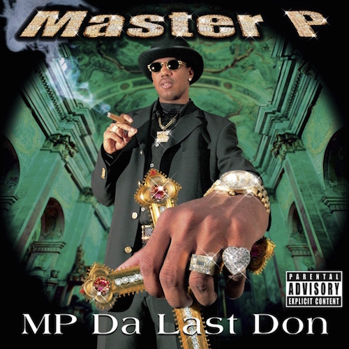
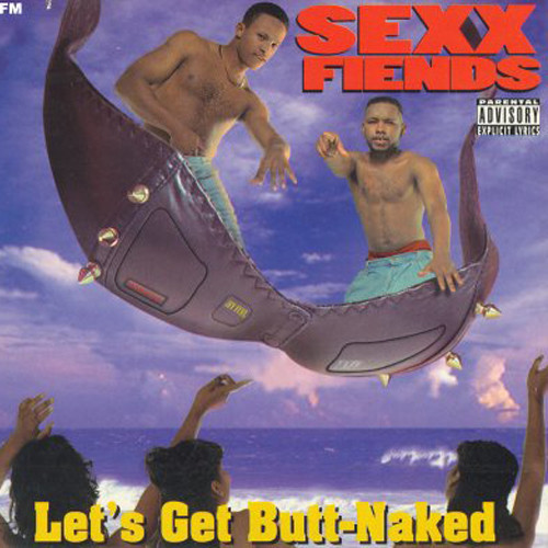
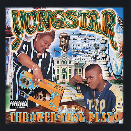
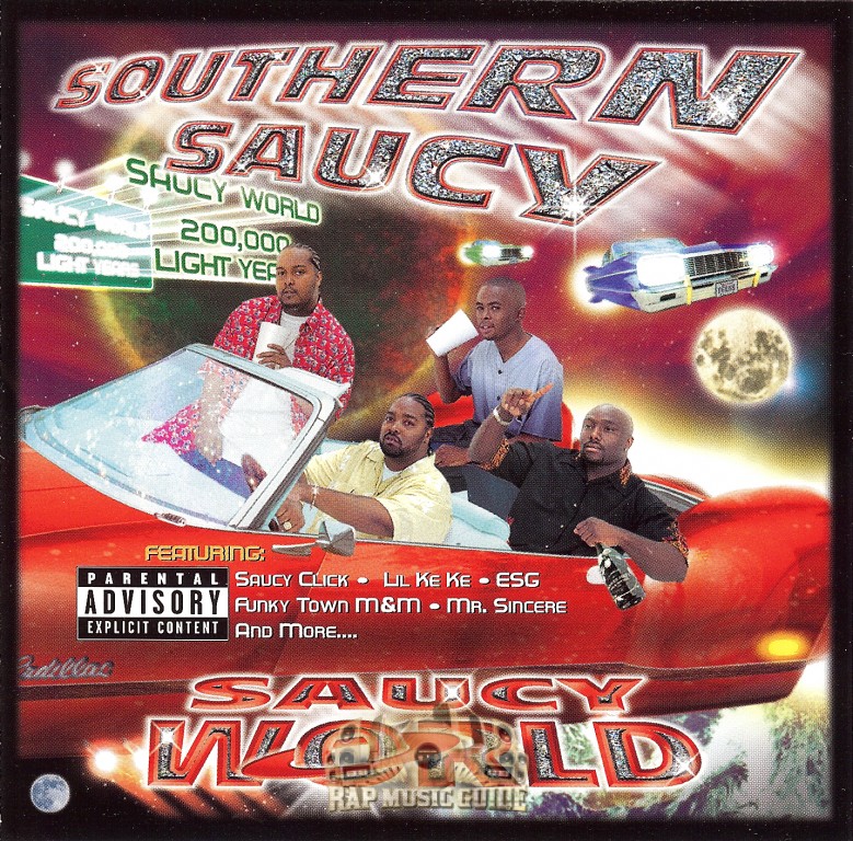
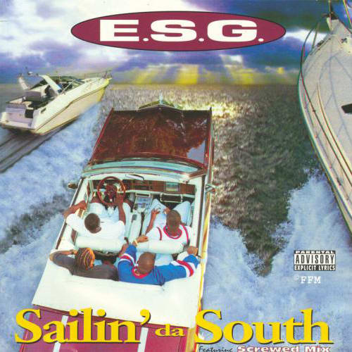
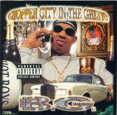
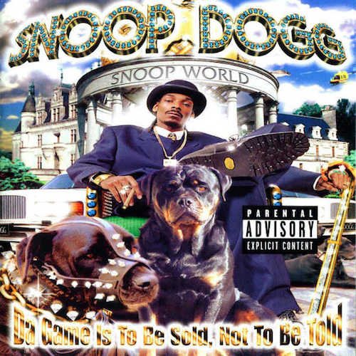
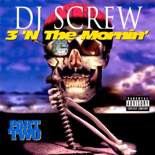
This individual that we speak of is Shawn Brauch, the creative innovator of Pen and Pixel. The wizard of bling help profound the legacies of Master P, Screwed Up Click, Cash Money Records, Chris Rock, and more. His work brought life into the art of design and how the riches of life can turn from dreams of tomorrow to the reality of today with the clients’ he’s worked with. As he paved a road for some of the industry’s brightest stars, he’s here to unravel his story of the creative empire he built with Pen and Pixel.
We had a chance to Brauch about his upbringing, his ideology behind the brand, working with Chris Rock, and more.
Read Below.
How’s Your Modern Life?
Modern life has a lot less stress since Pen and Pixel days. It seems more balanced with a wife and child. We are retired now in Florida, but still running two companies. I guess we’ll never really call it quits.
What are three things you have to do when you first wake up?
Coffee, play with my son, kiss my wife.
How was upbringing in Houston?
I actually didn’t grow up in Houston. We were raised in Southeast Asia, Japan, Singapore, Hong Kong, then finally moved to Rio De Janeiro before returning to the States for college.
Coming from the South, it’s a lot of disadvantages when it comes to creative industries, What inspired you and your brother to break the boundaries not only for Houston, but for the South?
We’ll Rap-a-lot records had much to do with that. My Brother was GM of the company, and was there from it’s infancy with James Smith and Cliff Blodget. Gangsta rap at that time was more of ‘shock’ to the first amendment than it was a serious musical genre. Society had to make adjustments and start understanding the frustrations that were being experienced by the racial divide.
This music allowed an avenue for that expression. My Brother and I had a better
understanding of racial prejudice than most white folks, remember being raised in a foreign county will impart a certain flavor in your core principles. Mainly, people judging you by the color of your skin will in turn formulate a sort of survival armor in your mind fueled by resentment. Never a good place to be.
It was the demand for this type of artwork in the south that was the impetus for Aaron and I to break out on our own and start Pen and Pixel Graphics.
Before Pen and Pixel came to life, what were some of the steps as far as planning goes allowed you to execute your vision for the company?
Both Aaron and myself are meticulous planners. We had to analyzed the market, understand the dimensions geographically, learn who our customers were going to be and what their demands would look like. Take into account the expense of the hardware (computers, scanners, printers, backup devices etc.) The expense of the software (Photoshop, Freehand, Quarkexpress) advertising and general business operation costs, including mistakes that cost thousands of dollars. This combined with employee costs and overhead, gave us a broad spectrum of our pricing structure and classification of artwork that we could start with.
Who were some of the first artists that worked with Pen and Pixel, and how do you think they helped shaped the aesthetic for Pen and Pixel?
When we started Pen and Pixel we had a few local and regional record and cassette duplication plants that we did bulk design work for. Names like Houston Records, Discmakers, Select-to hits and Southwest Wholesale come to mind. This really was the bread and butter of Pen and Pixel. We would crank out 30-40 covers a day. Really simple stuff but it required precision and relentless work.
Most notably the most relevant player in shaping Pen and Pixel’s work was Tony Draper with Suave House Records. Eight ball and MJG, Tela and Mr. Mike. Tony allowed us a pretty free reign but also participated in the design of some of these early Pen and Pixel covers. These really got the ball rolling for us. We are still friends to this day.
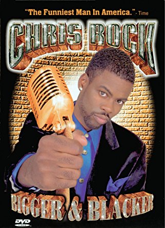
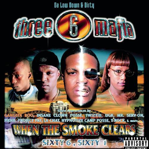
Aside from the legendary Cash Money, Screwed Up Click, and Three 6 Mafia covers, you also had other ranges of work as well. One being Chris Rock’s “Bigger & Blacker”. How was it to work on one of Rock’s breakout comedy shows oppose to working on another rap album?
Chris and I got along well. He’s actually we much the serious business man. He was straight forward on what he wanted and we discussed the photoshoot and later made refinements. A very easy transaction and one that set up a wonderful working relationship with HBO. The scope of the use of the artwork was something that was new to us, Billboards, TV spots, magazine ads, CD covers, video covers, the list went on. 48 separate layouts in all.
In the process of building the brand of Pen and Pixel, you went from designing the imagery of street life to focus on the aspect of the “Bling Bling” era. How can you explain the transition and how did it help you become a better designer?
This metamorphosis came at a time of awaking for by brother and myself. We knew the violence of the streets were consuming our clients and our friends. We decided to make a shift in focus as we found that some of our customers were using the covers to “dis” their rivals. Leading to some nasty outcomes. Blending the Bling-Bling aesthetic into the Gangsta lifestyle seems to be the logical choice. Who doesn’t like money, fine cars and women, right?
As for expanding my design sensibilities, this was an off shoot of dealing with much more complex covers and learning new methods to make each one stand out from the rest. The details in some of these covers can only be seen with a magnifying glass, but I know they are there!
Speaking on the aspect of design, the influence of Pen and Pixel is alive and well in today’s time. From tour merchandise to designs for online mixtapes, the inspiration of Pen and Pixel everywhere. Seeing many people redoing your work, how do you go about protecting your creative and intellectual property?
I feel honored that folks are inspired by the style of artwork. I also encourage people to learn as much as they can about design, composition, Photoshop, lighting and photography. However when I see someone ‘steal’ the artwork, put it on merchandising elements or cut it up and use it at their will, I call my legal team...they usually handle those ‘issues’. I have only sold and signed over copyright on four pieces of artwork out of 19,180 covers. They are all HBO covers.
In addition to the question above, how do you feel about the renditions of your work?
I have seen quite few renditions of my work. I applaud those designers and artist that covet the style. Paying homage to Pen and Pixel Graphics style by mimicking it only brings a smile to my face knowing it is a legacy that is worthy of such effort.
During these days, what is Mr Brauch up to?
I still do music covers, key art for TV programs, Book jackets and many other design related activities. I have had several Gallery openings in Europe, show casing Pen and Pixel artwork. I’m hoping for another show this year and perhaps one in Japan later next year.
I have the skeleton layout done for the Pen and Pixel Coffee table book and will be setting up another archive of PPG work at a university on the east coast this time. Between all of that I will continue my Volunteer Emergency Medical Service work here in Florida and in Oregon.
What are some goals of yours you want to accomplish this year?
I would like to get more of the PPG Book finished, it a great deal of work chronicling 19,180 covers. I have several publishers making deals but nothing seems too attractive right now.
How do you want Pen and Pixel to live on for years to come?
Pen and Pixel Graphics had it’s place in time. It set in motion an aspect of Hip-hop culture that has grown over the years. I think understanding the reason these covers needed to be illustrated so vividly was impart to attract attention on the record store shelves but more importantly to engaged the listener and bring them a little closer to the artist/songwriters creative motivations.
Pen and Pixel has become more of house hold name associated with the Bling-Bling, over the top-ness, ultimate fantasy excess, and I guess that is what it was about.
When it’s all said and done, how do you want to be remembered?
I would like to be remembered as a guy that was part of a team that brought humor and outlandish flash to the music industry.
Keep up with Shawn's work here


